QALAM
Master's Thesis Project

WHERE IT ALL STARTED
Growing up in Kuwait, Arabic lived on street signs, newspapers, packaging, and storefronts. Studying graphic design later made its structure clearer: direction, connections, spacing, rhythm. A system with its own logic.
In the West, I kept meeting designers who wanted to work with Arabic carefully. Qalam grew out of that gap: a digital guide to Arabic type and the thinking behind it.
كبرت في الكويت، وكانت العربية حولي في كل مكان: على
اللوحات، وفي الصحف، وعلى العبوات وواجهات المحلات. وحين درست التصميم،
بدأت أنتبه إلى تفاصيلها: اتجاه الكتابة، واتصال الحروف، والمسافات، والإيقاع.
وأدركت أن للخط الطباعي العربي منطقًا يختلف عن منطق الخطوط اللاتينية.
في الغرب، التقيت بمصممين يريدون العمل بالعربية، لكنهم لا يعرفون
من أين يبدؤون. من هنا جاءت فكرة قلم: دليل رقمي
يساعد المصمم على فهم الخط الطباعي العربي واستخدامه بوعي.
WHAT IS THE ISSUE?
The knowledge about Arabic typography is already out there, in books, archives, foundries, and scholarship. What’s harder to find is a way in. Most practicing designers need enough orientation to make a bilingual identity, publication, package, or interface with care.
Arabic is still often approached as ornament. For more than 400 million people, it shapes everyday reading, culture, and identity. When that system is mishandled, the cost shows up in clarity, trust, and respect.
المعرفة موجودة في الكتب والأرشيف والمسابك والأبحاث، لكنها موزّعة، والوصول
إليها ليس سهلًا دائمًا. والمصمم لا يحتاج إلى أن يصبح
مؤرخًا ليصمّم بالعربية؛ يحتاج إلى فهم يعينه على تصميم هوية
ثنائية اللغة، أو مطبوعة، أو تغليف، أو واجهة، مع مراعاة خصائصها.
ما زال البعض يتعامل مع العربية كزخرفة تُضاف في نهاية
التصميم، مع أنها لغة يومية وثقافة وهوية لمئات الملايين. وطريقة
استخدامها تؤثر في وضوح الرسالة، وثقة القارئ بها، وشعوره بأن لغته محترمة.
FROM PAPER TO PLAY
The work moved from a thesis digest of early ideas, to a schoolbook-inspired encyclopedia, then a denser editorial version, and finally a character-led interactive system. Across those shifts, the same instincts held: one idea at a time, image before explanation, system before decoration.
مرّ قلم بعدة مراحل: من ملخص لأفكار الأطروحة، إلى موسوعة
بروح الكتاب المدرسي، ثم نسخة أكثر تفصيلًا، وأخيرًا دليل تفاعلي
ترافق القارئ فيه شخصيات. تغيّر الشكل، وبقيت المبادئ نفسها: فكرة
واحدة في كل مرة، والصورة قبل الشرح، وفهم البنية قبل الاهتمام بالزينة.
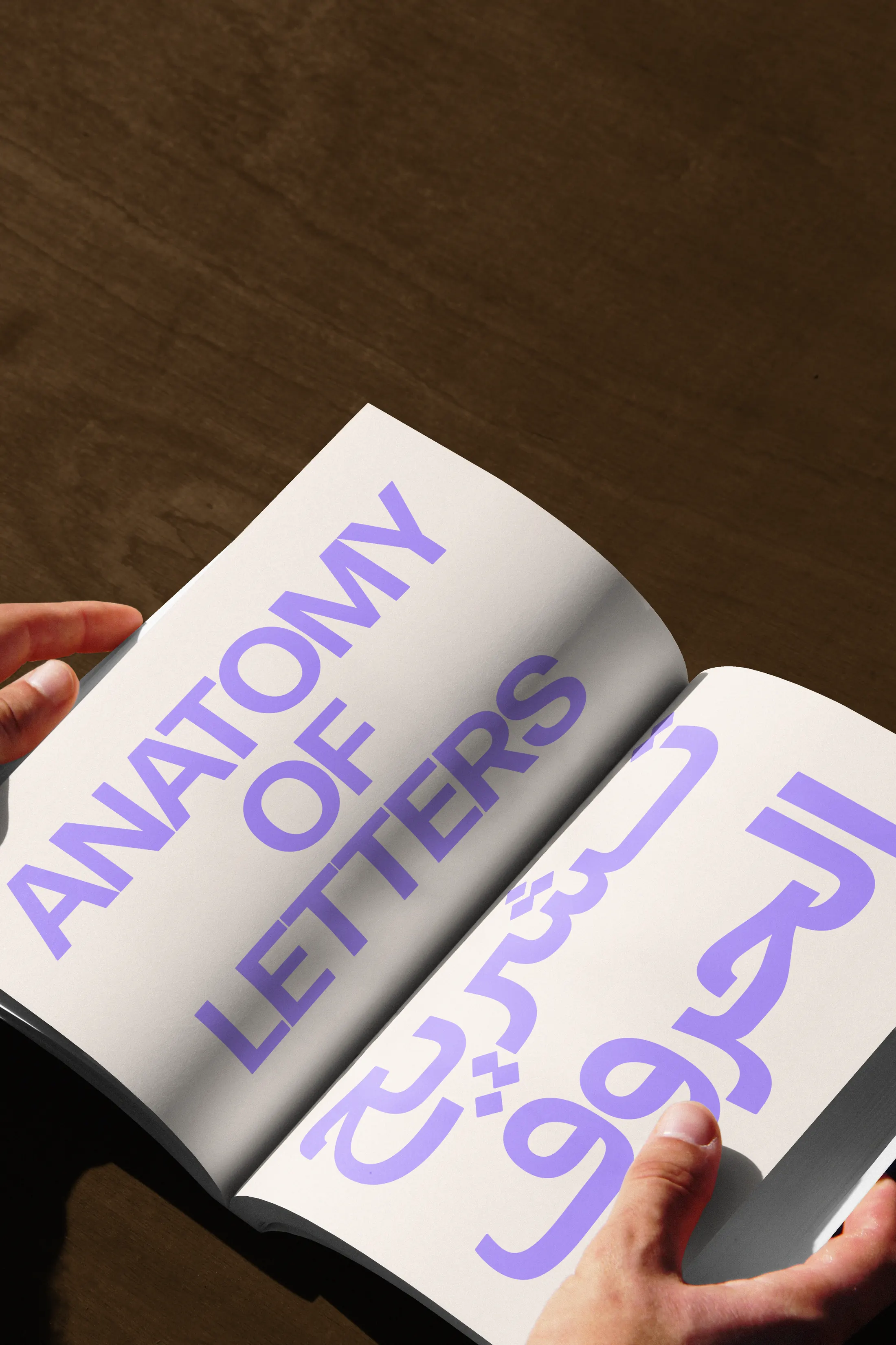
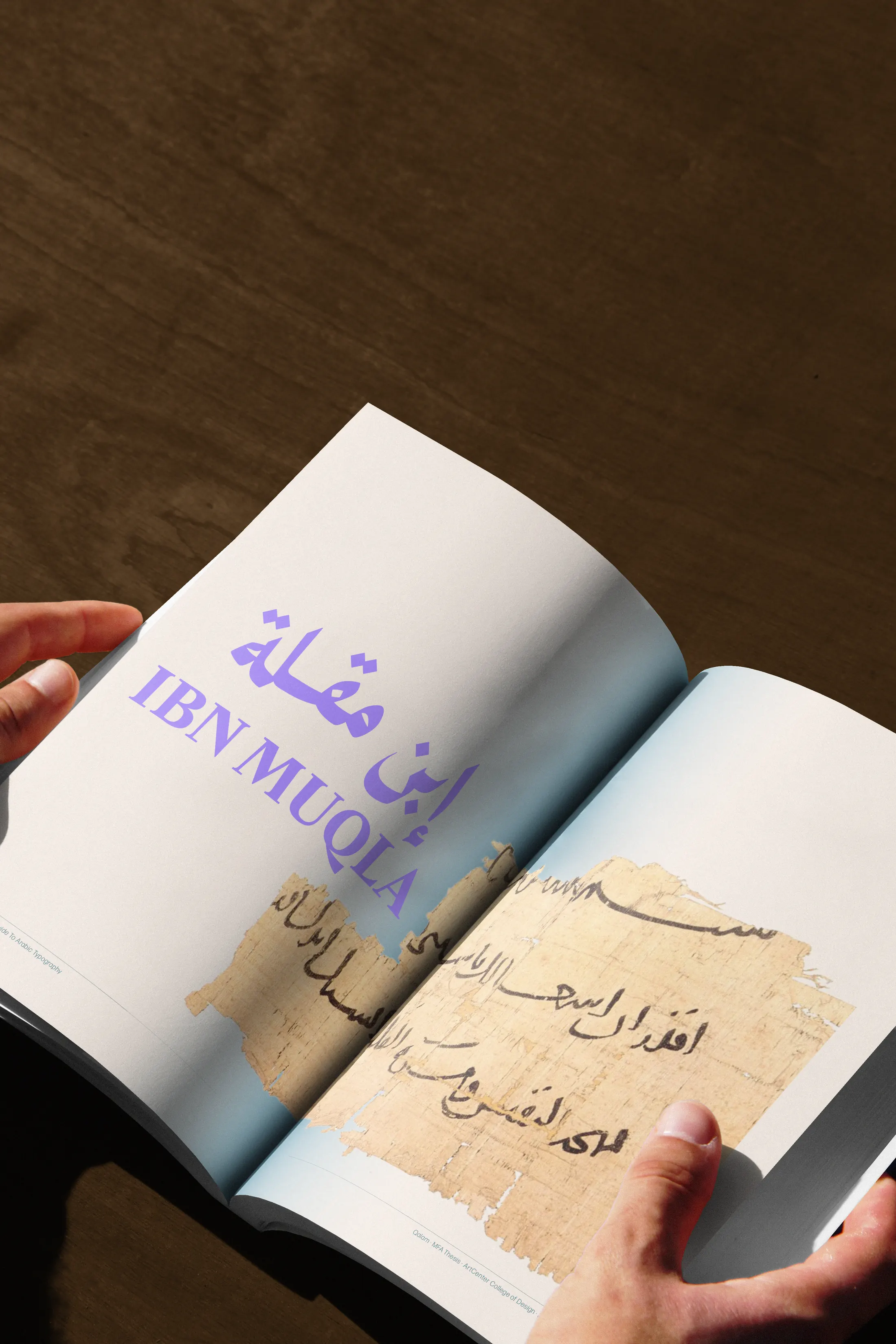
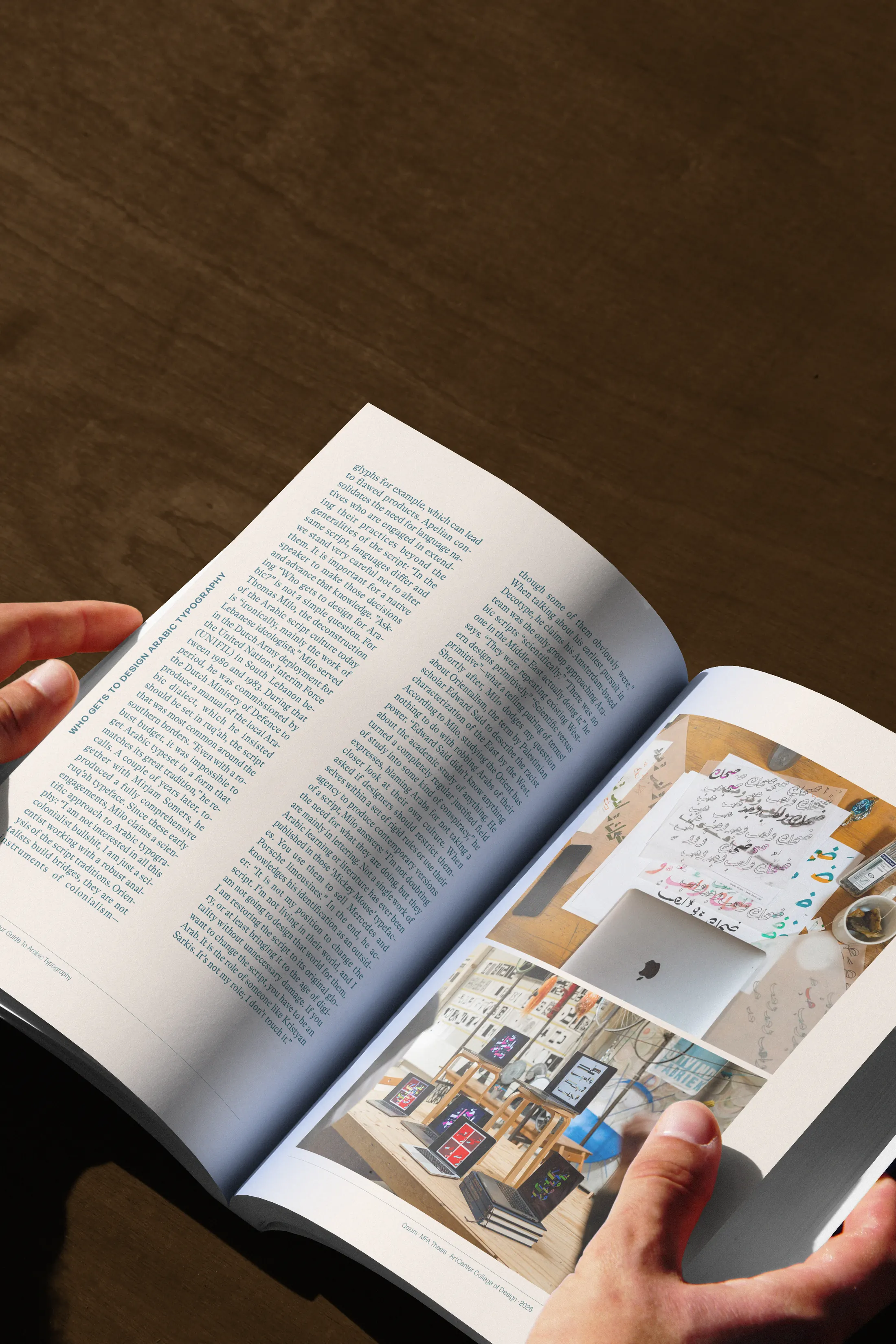
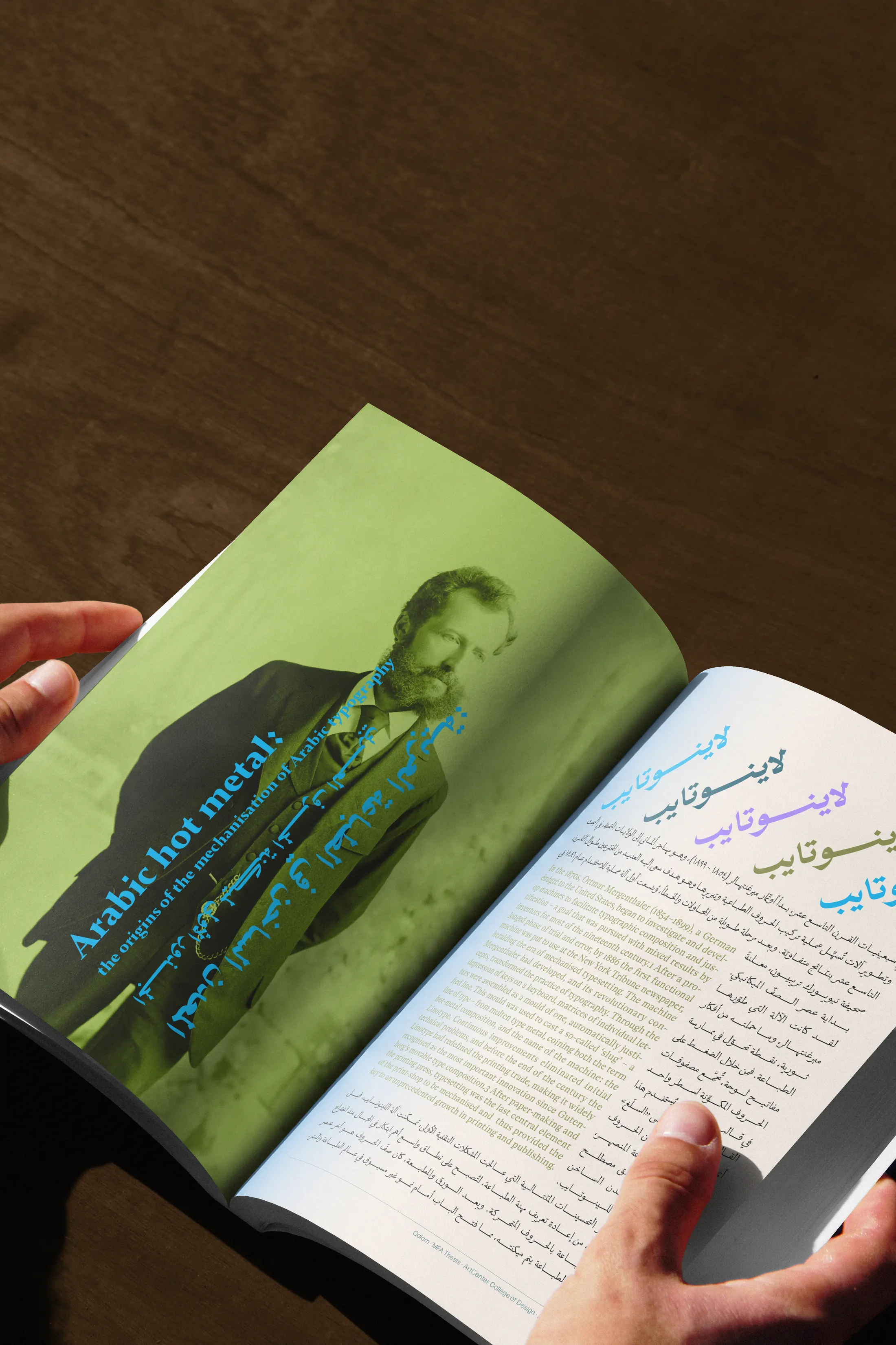
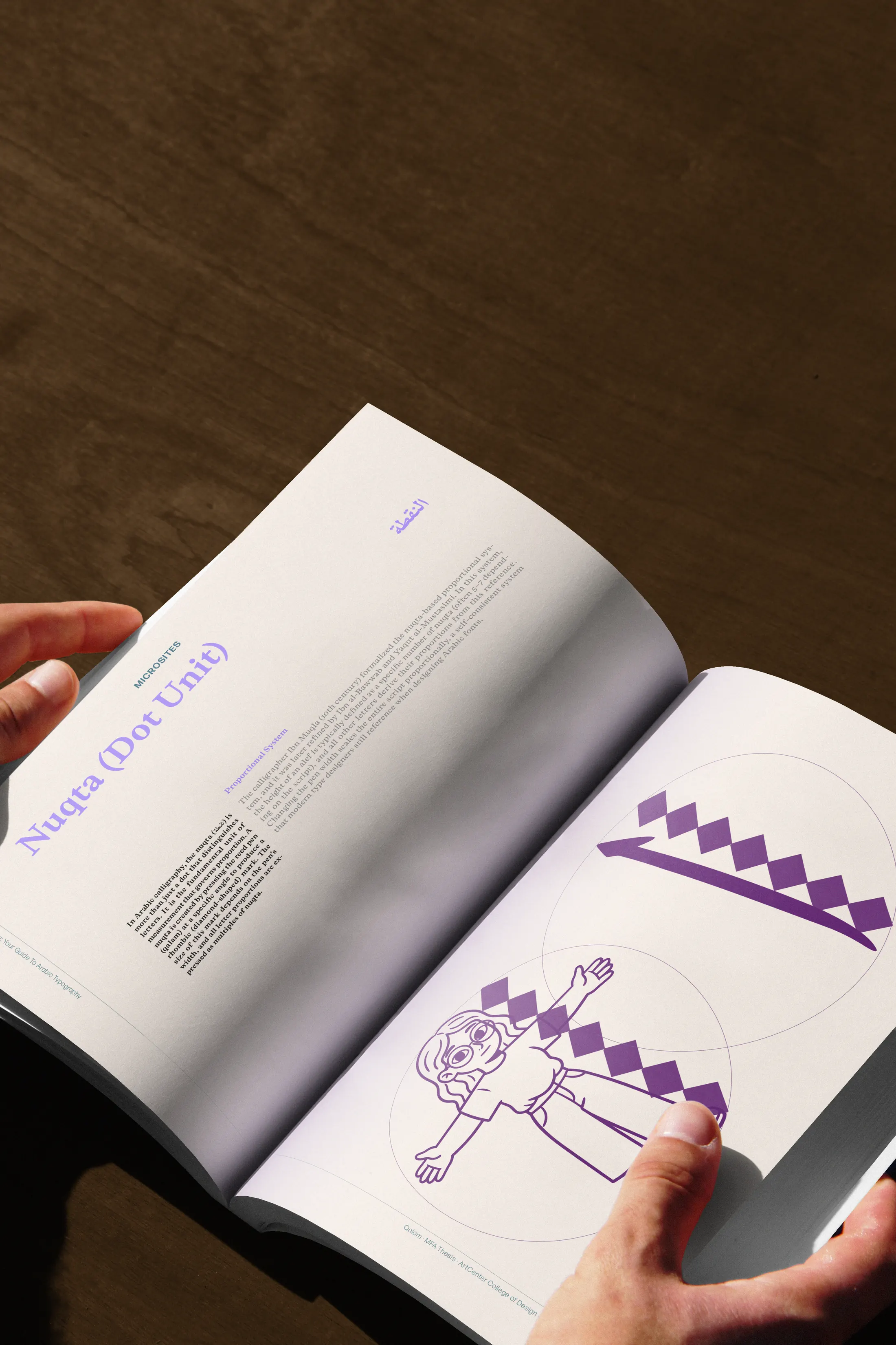
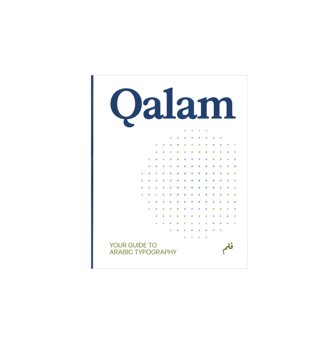
Alongside the product, a 212-page thesis book holds the research behind Qalam. It traces the history of type and of Arabic type in particular, from Gutenberg and early printing through metal, phototype, and the shift to digital fonts.
From there it moves into the making of the guide: the questions that shaped it, the paths tried and set aside, and the decisions that turned research into a system designers can use.
يرافق الدليل كتاب أطروحة من ٢١٢ صفحة يجمع البحث الذي
قام عليه المشروع. يتناول تاريخ الطباعة والخطوط الطباعية، مع تركيز
على العربية، من مطبعة غوتنبرغ والحروف المعدنية إلى التنضيد الضوئي والخطوط الرقمية.
ثم يعرض مراحل بناء قلم: الأسئلة التي بدأت منها، والتجارب
التي خضتها، والقرارات التي اتخذتها لتحويل البحث إلى دليل عملي.
PRODUCT
The live guide is at qalam.design. Categories lead into focused entries, related ideas, and a Play section built around noticing: recognition, comparison, observation.
Entries link out to related ideas, so exploring stays non-linear rather than a straight read, and the deeper research sits one layer down: there when you want it, out of the way when you don't.
The site was vibe-coded: built in conversation with AI, with me directing structure, interaction, and writing the way I would a collaborator. Generation is part of my practice: a way to move through making quickly while I keep the decisions that give the work a point of view.
الدليل متاح على qalam.design . تقودك التصنيفات إلى مداخل قصيرة،
يرتبط كل منها بمواضيع أخرى يمكنك استكشافها. وفي قسم اللعب،
تتعلّم من خلال الملاحظة والمقارنة.
لا يوجد ترتيب محدّد للقراءة؛ تتبع ما يثير فضولك، وتتوسّع في البحث متى أردت.
استعنت بالذكاء الاصطناعي في بناء الموقع، وكنت أوجّه تنظيم المحتوى
والتفاعل والنصوص، وأختار ما يناسب المشروع وأعدّل ما يحتاج إلى
تعديل. ساعدني على اختبار الأفكار بسرعة، وبقيت القرارات النهائية لي.
DESIGNED AS A FRIEND
Because the audience often learns faster from images than from dense text, the interface stays visual and quiet. Soft marks, a cream ground, and generous space set the tone before any reading begins, so the material feels approachable rather than academic.
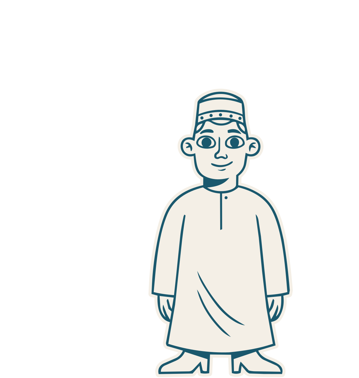
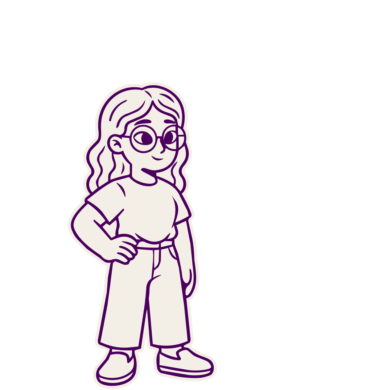
Salem, Hala, and Simsim run through it as quiet guides, in the spirit of vintage schoolbook illustrations. I generated the cast, then cropped, redrew, and directed each figure until the line and attitudes felt authored.
Each carries a different kind of attention: calm observation, curiosity, and a lighter sense of play. Their forms draw on Arabic visual identity, so the cast belongs to the subject rather than borrowing familiar Western illustration habits.
اعتمدت الواجهة على الصور، مع علامات بسيطة، وخلفية كريمية، ومساحات
واسعة تريح العين. أردت أن يكون الدليل سهل التصفّح، وأن
يشجّع على الاكتشاف من دون أن يبدو كدرس.
سالم وهلا وسمسم يرافقون القارئ في الدليل، بأسلوب مستوحى من
رسوم الكتب المدرسية القديمة. ولّدت الصور الأولى للشخصيات بالذكاء الاصطناعي،
ثم عدّلتها وأعدت رسم أجزاء منها حتى وصلت إلى الشكل الذي أريده.
لكل شخصية طبعها: واحدة هادئة تلاحظ التفاصيل، وأخرى فضولية، وثالثة
تحب اللعب. واستلهمت أشكالها من مراجع بصرية عربية لتنسجم مع موضوع الدليل.


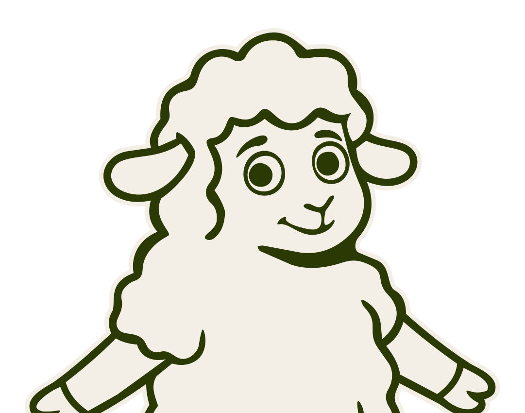
Salem
TAKE THIS WITH YOU
The result is Qalam: a live guide, a 212-page thesis book, and a cast of characters that together turn scattered knowledge into something a designer can move through. Success looks like leaving more sure of what to notice, and able to meet Arabic on its own terms.
قلم محاولة لجمع هذه المعرفة وتقديمها بصورة تساعد المصمم في
عمله. ونجاحه بالنسبة لي أن تخرج منه وأنت أكثر انتباهًا
إلى خصائص الخط الطباعي العربي، وأقدر على اتخاذ قراراتك عند التصميم به.
